Wednesday 28 October 2015

Shape

Shape


I chose this image because I think it represents the theme of shape well, there are two shapes the circle ring, makes a heart shape with a shadow on the page.


This image also represents the theme of shape. It could also go in the theme repetition, the image is shown to make the flowers look three dimensional, which is also shown by the form.


This image also shows shape well, all the different trees are similar but each one has a slightly different shape. The trees are also silhouetted which makes the shape stand out more as there are no features to focus on. 

My Photos


I took this image because I think it represents the theme of shape well. It shows a tree that looks like multiple trees twisted together, which gives it a different shape, it is also showing other trees that look like normal trees which shows the difference in shape.


I believe this image also shows the theme of shape well. It has 4 pumpkins which are all different shapes. We have the original shape in the top right corner, and the other 3 pumpkins are shaped differently. 


Saturday 17 October 2015

Form


I chose this image because I think it represents the theme of form well, it shows the light coming from an area, which only hits one part of the objects in the photo. 

 This image also shows form well, the light is shown to be coming from the top of the image. The white background is also effective because it shows the form of only the bananas, instead of objects around.
This image also represents form, it is not as obvious, but the metal part of the pen shows form.

My Images


Friday 16 October 2015

15 Day Challenge

Shoes


Self Portrait


Repetition


Shoot Like Cartier-Bresson


Make A Hockey 'Joiner'


Friday 9 October 2015

Space

Space


I chose this image because I think it represents space well, there is a negative space, which means there is a lot of empty space in the photo. The balloon is the main focus point.
This image also has a lot of negative space, the leaf adds colour and definition to the dull background behind it. The lines on the leaf, add a sense of direction to the image.  

In this image, there is also a lot of negative space. It has good definition, and very sharp colours. The 
bug and the stem are in 

My Images


Tuesday 6 October 2015

Timeline

Camera settings


Camera Settings

ISO


I chose this picture because, it shows the difference between the low ISO and the high ISO, it shows that when the ISO is higher, it is a lot more grainy than when it is lower.

This image also shows the difference between high ISO and low ISO, as above it also shows the difference in the amount of grains, and it also shows that it gets darker when the ISO is lower.


My ISO

This image is using a low ISO, this means that the image is more grainy than the other. This means that the image is a lot less clearer than the other image with the high ISO


This image has a high ISO, this means that the image is a lot clearer, and does not have many grains. High ISO also makes the colours brighter, and makes it stand out more.

Aperture


I chose to use this image as i think that it represents the aperture well. The flower and the butterfly are in good focus, where as the whole of the background is out of focus and blurry. It also makes the flower and butterfly look more realistic.


This image also represents aperture well, the plant and the caterpillar, are in focus, where the background is extremely blurry, this makes the centre of focus the caterpillar which is the main part of the image.


My Aperture


This image uses a low aperture, it shows the subject in the back being blurry, compared to the subject in the front. This makes the image look more effective, and makes it look 3D


 In this image, I used a high aperture, this shows the subject in the background, and the subject in the foreground both being in focus. this makes the image look more 2D


Shutter Speed


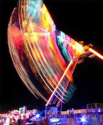
This image is a fairground ride, using a slow shutter speed, it makes the image look like it is moving, which is what it is doing, it is a good effect as it makes the image interesting to look at.


This image also represents slow shutter speed, it is a image of fast moving car, the slow shutter speed also makes it look good, as the car is seen to be moving fast, and the surroundings are perfectly in focus.


This image is also represents shutter speed, but is different to the others as the photo is taken with a fast shutter speed, the image shows a fist punching some water. 

My Shutter Speed

This image uses a slow shutter speed, this means that the shutter takes a longer time to shut, meaning moving objects become blurry. Which in this case, is the scrunched up bit of paper.

This image uses a faster shutter speed, this means that the paper is in focus, and looks like it is not moving, and is just floating in mid air. Whereas in the other photo it looks like it is moving.


Camera Sim


Windmill Blurred

Background Blurred


Freeze all movement


Everything in focus